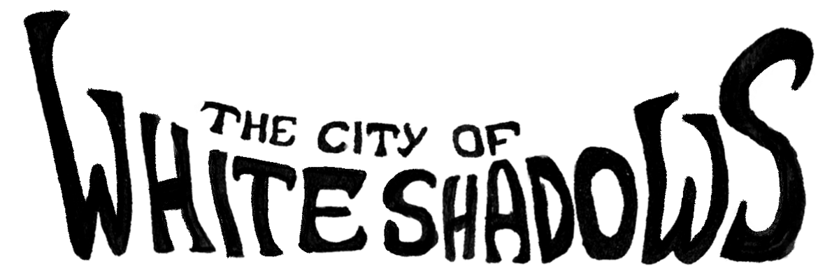
The City of White Shadows - Title Typography
The City of White Shadows is a storybook created as a design project for my third year course, DESG383 - Graphic Design Project. Since it was an assignment for a course, the brief for this project was very broad. The project was meant to:
- Cover any topic or issue under the broad category of "Climate Change".
- Provide an opportunity for students to explore the lengths of graphic designing for a project.
- Allow students to learn and improve their graphic design knowledge and skills.
- Serve as an evaluation measure of the students' graphic design knowledge and skills.
Over a period of 3 months, students worked on their projects with the assistance of the faculty to create their own graphic design projects. At the end of the course, students had to be ready with their intended design artifacts and a presentation detailing the process.
For this project, I created a storybook titled "The City of White Shadows". This storybook is for all ages and is meant to shed light into the issue of coral bleaching, which is one of the lesser known problems caused by global warming and climate change. Have a look at my journey creating this book!
Programs Used: Procreate, Canva
Duration of Project: 20th February, 2024 to 19th April, 2024

At the very beginning of the course, my initial direction was to understand graphic design for raising awareness and creating an impact. So, I looked up various posters that pertained to different social messages to analyze their design elements.


Through this poster, my intention was to raise awareness about the issue of coral bleaching to the Indian audience. The art style found on Indian trucks was quite appealing due its vivid colours and intricate patterns because these are the same aspects of corals that were being lost through bleaching. Therefore, I initially intended to use this art style in my poster.
After analyzing pre-existing graphic design and its elements, I looked into what had already been done to raise awareness of this issue - a graphic literature review. Through this, I found that most visual material on the topic was in the form of infographics that were highly text heavy and had a lot of technical/scientific jargon. The appeal to laypeople was very low.


Seeing the type of content that already existed, I was conflicted about the decision to create posters for this issue. It seemed as though it would not contribute much to the existing media. Other ideas were considered, such as an interactive poster, or changing the topic to overfishing. However, these did not stand out as much and also had logistical challenges.
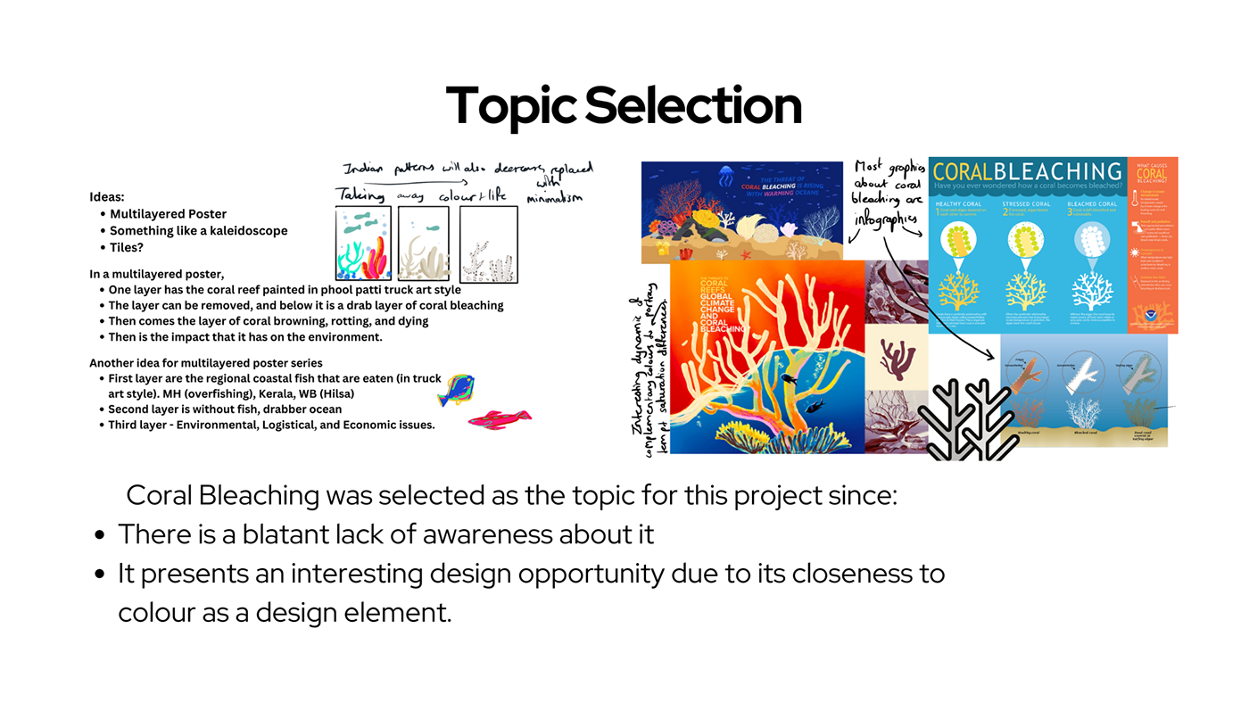
After moving on from the initial decision to create posters, I perused through various forms of media where graphic design was utilized. That is where it dawned upon me to create a storybook.

Thus began the creation of The City of White Shadows. The first step was to write the story. The wording was simple, and a loose rhyme scheme was incorporated to enhance the flow of the story.


After a rough sketch of the storyboards and pages, it was time to select the colours and fonts that I would use to flesh out these templates.
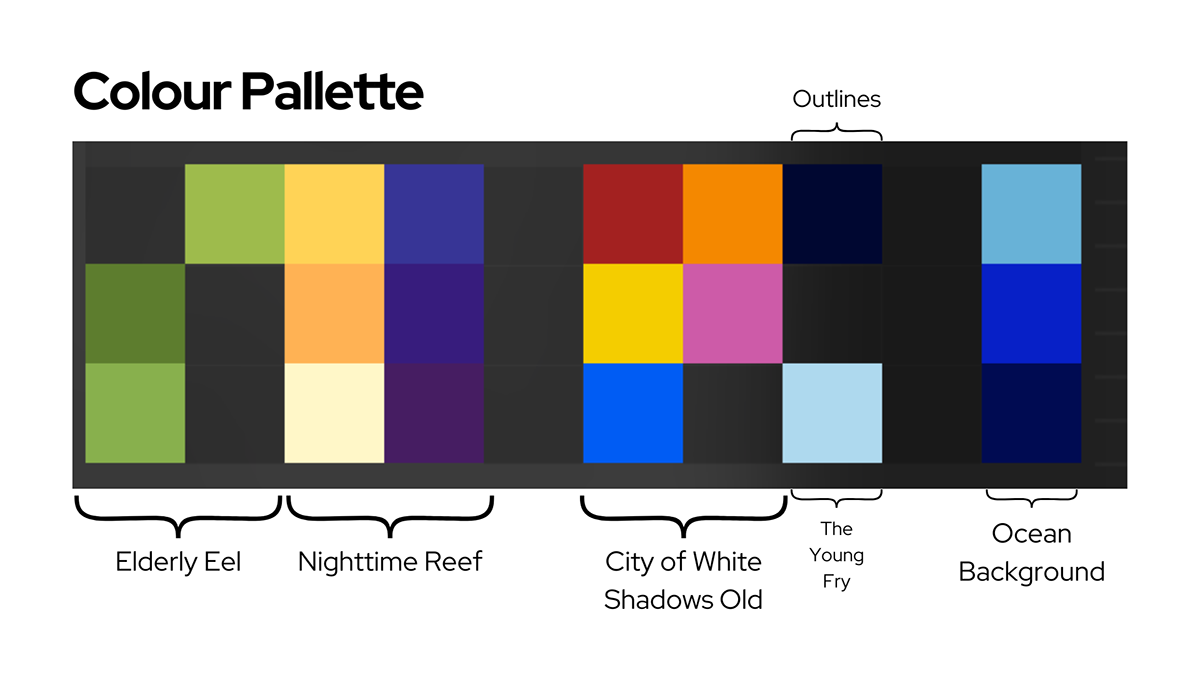
The colour palette for the eel was based on real-life references of green moray eels. The young fry were a pale blue colour to give them a simple appearance. The colour palette for the nighttime storytelling scene was composed of contrasting violet and yellow shades for fleshing out the quiet atmosphere. On the contrary, the colours for the coral city in the eel's narration were bright and saturated to increase the amount of activity in the scenes. These bright colours would also show a stark contrast to the bleached corals later in the story. The outlines of the characters and storytelling scenes were a dark shade of blue to avoid the high contrast and strain of black outlines.

After colours and typefaces, it was time for focusing on the character designs.


Once the content inside the book was mostly ready, it was time to move onto the cover of the book. The colour palette for the cover was mainly blue and white, inspired by the cyanotype method of creating artwork. Instead of choosing a readymade font, custom typography was hand-drawn. The letters of the typography were meant to resemble corals, with their textured silhouettes and varying thickness.

Minor changes were made to the typography to incorporate some breathing room and space for author/illustrator credits. A back cover was made by darkening the same illustration.

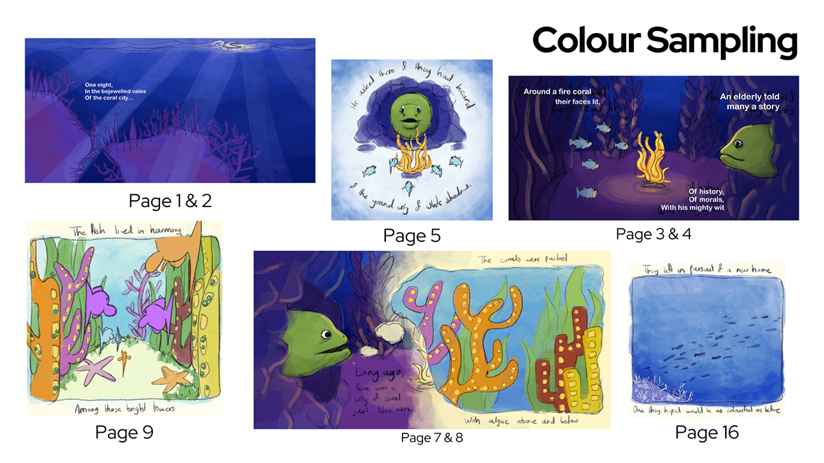
After this long process, the final pages of the storybook were created.


In the following photo grid, you may peruse through the final illustrations for the storybook:


In the photo grid below are the final pages of the storybook:


This project was truly an enriching experience for me, and I look forward to employing my illustration skills in the future again. I am grateful to have been given the opportunity to explore this field in depth, and to have the opportunity to contribute to raising awareness to this pressing issue.


